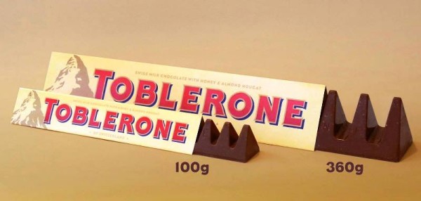
Cutting down the length and weight would have been okay but UK fans of Toblerone went up in arms when the iconic chocolate brand Toblerone was rendered overly spaced out between the triangles, a move that its maker insists is purely economics. But the English blame Brexit.
And Mondelez International begs to disagree. The Toblerone maker thought that stretching the gap between the triangles is the best compromise. The plan really was to cut down on weight but keep the chocolate bar's old length, thus preserving the original packaging.
For instance, a bar weighing 170 grams is down to 150 but the external form factor remains the same. But when unpacked, Toblerone fans were horrified, CNN reported. And one loyal buyer took to Twitter to express her disgust:
And many guessed that Brexit is to blame or the recent vote for the United Kingdom to leave the European Union:
But no, the new Toblerone look has nothing to do with politics. It's all about downsizing of production cost and reduced weight of each bar is to keep the product affordable, according to Mondelez. "We are experiencing higher costs for numerous ingredients. We carry these costs for as long as possible, but to ensure Toblerone remains on-shelf, is affordable and retains the triangular shape, we have had to reduce the weight of just two of our bars in the UK," the company said in a Facebook post.
But it was unclear if the spaced out and downsized Toblerone is exclusive for now in the UK though Mondelez is clear that the change has so far only affected specific variants of the chocolate bar.
In a report, BBC said Mondelez confirmed that Brexit did not influence the new Toblerone cut. "This change wasn't done as a result of Brexit," a company representative was quoted by the report as saying. Specifically, the decision was due on the current foreign exchange rate, which Mondelez characterized for now as "not favorable."
Still, Toblerone fans "do mind the gap," CNN said. It would have been more acceptable had Mondelez kept the original gaps between the triangles and cut the length of the bar. As one user commented on the company's Facebook page: "You should have reduced the length and kept the chunky triangles."
The new Toblerone, spaced out and downsized, "it looks dreadful," the same user said.


