A McDonald's outlet in Hong Kong is the talk of the town because of its futuristic design. Located near Admiralty Station, the store's design was by Landini Associates.
It uses stainless steel at the ordering station, making the interior look like a bank instead of a fast food chain. The chairs and tables use grey-silver-yellow combinations instead of the usual yellow-and-red combination found in most McDonald's.
Landini, in an Instagram post, explains the simpler, quitter and more classic approach compared to more colorful graphic environments in other McDonald's or Maccas to "hero the food, the service and the people who come to enjoy it," quotes Kotaku.
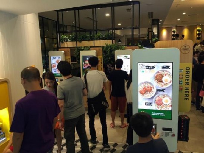
The outlet features the Create Your Taste touchscreens that was first seen in McDonald's Australia. Besides the electronic self-order board, all the tables offer wired and wireless charging stations which is a boon to people who need to connect or recharge their gadgets.
The touchscreen menu was first introduced in McDonald's Australia in 2014 and now all Maccas outlets have that technology where diners could create their own hamburgers from over 30 ingredients. The toppings offered, such as pineapple, grilled mushrooms and four types of cheeses, are often not available on the standard menu.
And to ward off accusations that its food leads to obesity, the Hong Kong store offers a wide choice of fresh meals such as veggies and salads as well as different types of bread for variety.
However, one comment posted on Instagram notes that despite the store's sleek look and hi-tech offerings, schuchutrain notes that the outlet is not crowd-friendly during rush hour.
